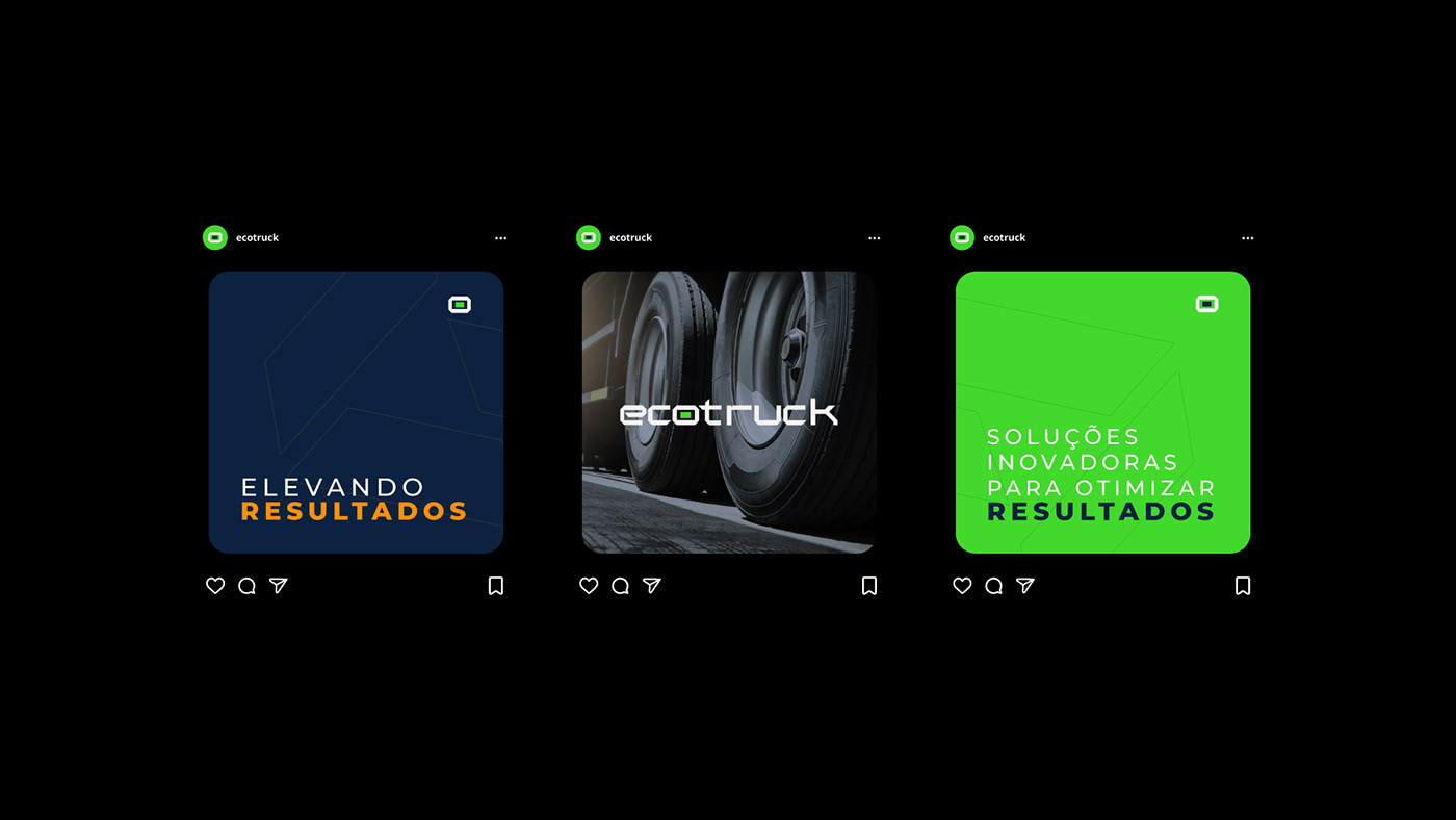
Innovative solutions to optimize results
Case
EcoTruck is a 100% Brazilian company, with around 30 years of experience in the automotive market. Always looking for innovative solutions for management, it's main focus at the moment becomes the work with telemetry of fleets for trucks, tractors and heavy machinery, initially focused on agribusiness and large logistics companies.
With this new phase of the company, and the need to visually represent its differential and unique services in the market, it was time to create a new visual positioning.
Solution
When we asked the customer what he was looking for with the new brand, we identified a modern, current, innovative brand that brings technology to the fore, but also the "eco" linked to efficiency. The challenge was to avoid icons or representations that referred to “safety”, since this is not the focus of the products.
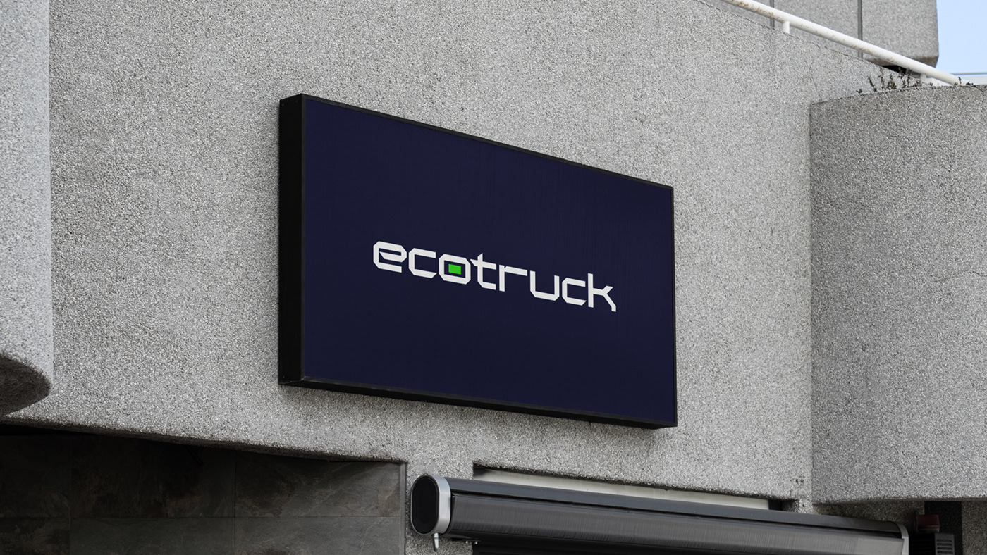
With all these details in mind, we created a unique logo extremely linked to technology, innovation and with a strong aesthetic presence - distancing itself from market competitors.


Color Palette
As the color palette of the company's previous brand had red and orange as the main colors, we decided to follow a different path from the one previously explored. We then studied a new color palette that would connect with agribusiness, but without restricting it to this specific segment.
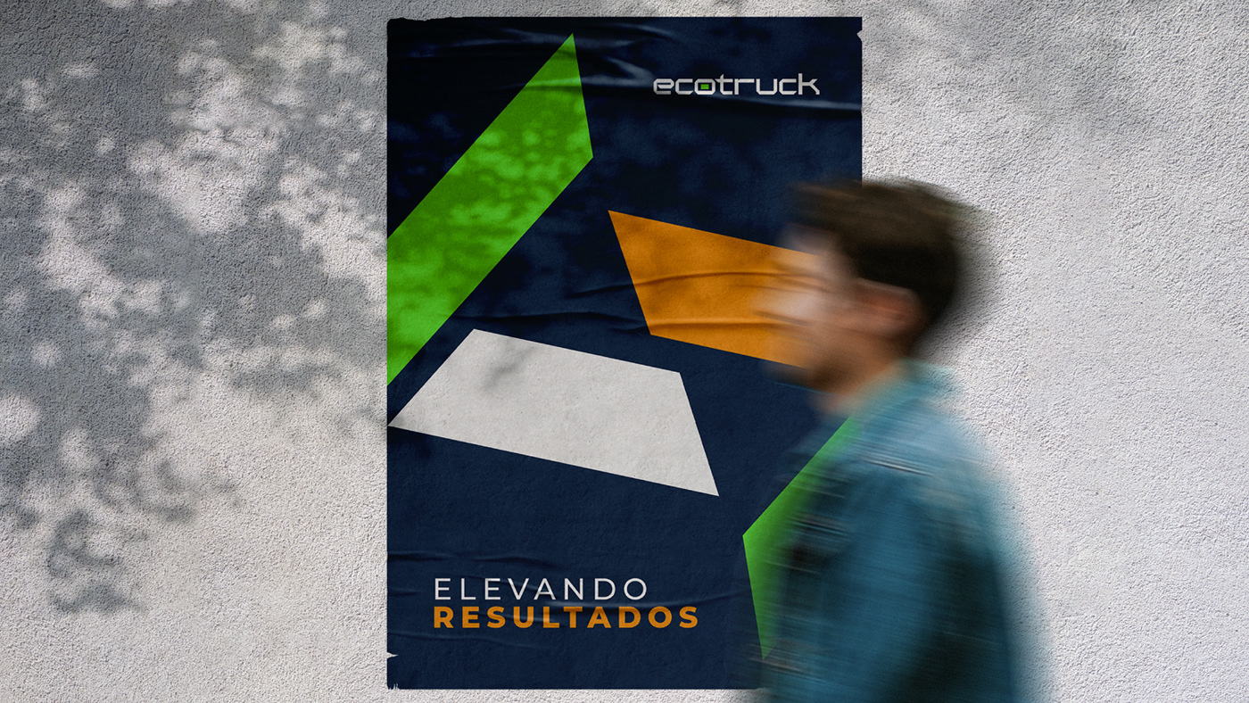
So we selected blue, close to the shade of navy blue, as the main color of the brand, representing the technology and innovation present in the company's processes, and a vibrant green as a secondary color, this way representing agribusiness.
We added a third color, orange, as support for details or possible future deployments – and subtly refer to the company's old brand.